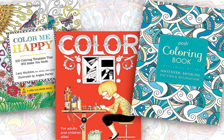
Have you noticed the trend of adult coloring books these days? It’s become an international phenomenon. Lately we’ve noticed (and taken advantage of) the vast array displayed at bookstores, craft stores, and gift shops. When searching on Amazon.com for bestsellers, up pops a category for “adult coloring book bestsellers.” It seems cookbooks have taken a back seat! There is a category for “Coloring Books for Grown-ups” that has 356 books to chose from—more than double the Children’s Activity Books of 151.
So what’s the big deal?
These days, our lives are filled with long hours, frequent deadlines, and endless social obligations. According to experts, coloring books can help us unwind and reduce stress. The books provide a connection to childhood, when things seemed simpler. Picking up a crayon or colored pencil transports us to the past. It can also be a creative outlet (for those with less “artsy” jobs), and best of all, there’s no pressure! Regardless of artistic ability, coloring inside the lines is simple. There’s no wrong way to color!
Research shows that coloring stimulates your right brain and helps you think more clearly. You’ll find coloring books therapeutic, educational, and just downright fun! Staying inside the lines takes focus, but not stress. Clinical counselors say the activity opens up the frontal lobe of the brain—the home of organizing and problem solving—and focuses the mind by allowing colorers to forget their worries.
We understand that while many consider this hobby for solo activity, there are also adults who gather to sip wine and socialize while coloring. Because little concentration is required to fill in a pre-drawn image, you can be yourself and let go.
Crayola has recently jumped on board with the trend. Their line of adult coloring books is called Color Escapes. It is 11×17 in order to fit into a standard-sized frame, so you can easily color, frame, and hang your work! Color Escapes books come in four types, including Geometric, Kaleidoscope, Nature, and Garden themes. It’s a great way to relax–and a great way for Crayola to sell more crayons!
You can also easily find many one-page designs to print and color for free online. So give it a try!
Quilts, Inc. has been a valued client of Hunter-McMain, Inc. and it’s small division, Cheep Cheep Postcards™, since 1991. Hunter-McMain has served the advertising and graphic design needs of a wide variety of businesses in the Houston community since 1989, but our relationship with Quilts, Inc. is unique. With the growth of our two companies has come expanding opportunities for advancement and collaboration. Now, we are delighted to announce that our Cheep Cheep Websites™ division is designing a new website for Quilts as well! We anticipate being ready to unveil the new website design before the new year.
This month, in addition to developing the new website, the designers at Hunter-McMain, Inc. and The Cheeps are busily preparing advertising materials for Houston’s annual International Quilts Shows, which will take place October 24-November 1 at the George R. Brown Convention Center. The International Quilt Festival is the largest convention held in Houston each year, as well as the largest annual quilt show in the world.
Hunter-McMain and The Cheeps are dedicated to providing creative advertising and graphic design services for many long-term clients, but we have an especially long and fruitful relationship with Quilts, Inc. According to Hunter-McMain’s founder and CEO Jeanne Parker, “Although we’ve been doing work for Quilts for over twenty years, each year is just as exciting as the last! They started with just one show, and now they’ve expanded to multiple shows in major cities. They’ve grown and we’ve grown with them.”
..
In anticipation of the upcoming Quilts Shows, Hunter-McMain is giving away free tickets to the annual Houston Quilt Festival (Oct.24-26) to the first 10 people to like and share this article on social media! Be sure to tag us in your share on Twitter, Facebook or Pinterest, and message us for details on where to pick up your tickets! (must be in the Houston area to be eligible)
That’s right, folks! It’s McDonalds-o-clock! There’s a lot to love about Mickey D’s billboard. First off, it’s a working sundial. That’s pretty darn impressive, if you ask us! Second of all, it features images of all the delicious food that makes up America’s favorite fast food breakfast! And thirdly, we love that the images speak for themselves. The marketing geniuses at McDonalds know that the majority of people are familiar with their brand, so instead of using this billboard to share information with consumers (i.e. this is who we are, this is what we do) they simply use it to remind us that it’s (literally) time for a visit. The ad is a tad outdated of course (as we all know, McDonalds serves breakfast all day now!) but it also served to remind us the hours that breakfast was sold—so it was useful and unique!
We love this billboard for its simplicity and cleverness. Everyone knows what duct tape is and what it’s good for (pretty much everything), so what this ad does is suggest that 3M brand tape is better and stronger than many off-brand tapes (this, in my experience, is actually true). The ad is clean and simple, but also kind of fun—after all, that’s a giant roll of duct tape holding that sign in place!
image courtesy of world.kapook.com
Last but not least is this fantastic ad for Capisco hot sauce! While this Indian hot sauce brand is not as widely recognizable as McDonalds or 3M, the designers are still able to send a pithy message with nothing but an image. The bottle shape, color, and label make it clear that this is a hot sauce, and the hole that appears to be burned into the billboard (you can see right through it! We love the commitment here!) makes it clear that this is a HOT sauce. It’s clever, it’s clear—it’s all we could ever want in a billboard!
What are some of your favorite billboards? Send us recommendations in the comments, or on Pinterest or Twitter!
Ah, Autumn! The weather turns cool, the leaves turn colors, and we can all bundle up in warm cozy sweaters and drink cocoa around a crackling fire! At least…some people can do that. Here in Houston, of course, it stays a balmy eighty or ninety degrees until well into October. Leaves stay green, grass keeps growing, and the only time it would make sense to drink cocoa is when you’re trapped in an air-conditioned office all day!
This is exactly why we are loving Color Marketing Group’s September color alert, “Etnico.” With a little of this warm, earthy orange in your life, it really does feel like fall! “Etnico” reminds us of autumn leaves and pumpkin pie, and we think it’s the perfect addition to your fall ad campaign.
Here’s what Color Marketing Group has to say:
Courtesy of elitemillennial.com
“Bringing to mind hardened earth, baked pottery and, indeed, the orange of the setting sun, the color embeds
itself deeply in products. It celebrates when enhanced with a metallic effect, seduces with a matte richness and glows with a polished gloss.
Not just a simple terra cotta, Etnico takes orange to a new level in home and office. It is becoming a new staple for leather and a solid color coordinate to copper. Count on it to accent classic hues like plum, navy blue, and ivory, and to create a new twist with charcoal grey, wine and olive green.
Earthy, yes, but also sophisticated, charming and energized.”
Love it, love it, love it! Take a cue from the experts and incorporate a little “Etnico” into your next design for a bold, warm, earthy look.
This chick likes “Etnico” too! A lot. Like, way a lot. Image courtesy of CMG.
Many people fondly remember the “good ole’ days.” Back when everyone sat down for Sunday dinner, singing kids played hopscotch in the streets, and couples could get into the drive-in for a nickel—those were the days!
Of course when it comes to graphic design, the nostalgia starts to…wear off. Before the advent of programs like Photoshop and InDesign, creating logos and ads was a significantly more painstaking and time-consuming process than it is now! It involved cutting out pictures and text with razor blades, carefully gluing (or waxing) things in place, and drawing perfectly straight lines, over and over.
Hunter-McMain, Inc. has been in business since 1989—and when we started out, we didn’t even use computers! Our designers can remember back (not so fondly) to long hours cutting and waxing down all the components of an ad until it was just so—only to start over from the beginning when the client decided he wanted a different font or a new image.
In fact, we still have some old design tools sitting around the office! Designers used tools like these to create their designs:
Lectro-Stik WAX (left, center) was applied to the back of type photo paper to attach it to art boards. Rubber cement (right)was used to adhere regular paper or “placement” photos (that is, photos used to determine the placement of an image within the ad.)These special pens known as Rapidiographs, were for creating specific line-widths by hand.This “die-cut” was a specially made (and expensive) metal stamp, used to emboss paper! The designer usually owned the die-cut and sent it to the printer to use on the final product.This fancy stuff is called Letraset. The letters could be rubbed off onto paper one by one, but it had to be done right or parts of the letter wouldn’t stick and the image would be ruined!
This great video by the publishing and multimedia company Airows shows the pre-computer process of building an ad! Our veteran designers at Hunter-McMain have confirmed that, yes, this is actually how they used to do it. Watch:
.
BONUS: This beautiful tool is called the “Gentle Rub Electric Eraser.” That’s right, it’s just an eraser. That is ALL it was used for. You’re welcome.
This week’s “Advertising That Works!” is interactive—and tasty!
Lay’s latest campaign, “Do us a Flavor: Tastes of America,” takes foods from four different regions of the US, makes them into a potato chip flavor, and asks America to vote!
The bags themselves are great advertising: they encourage consumers to vote on their favorite, which also makes them want to buy not just one bag of chips…but all four! Not only does this increase sales in the short term, but it also increases brand engagement by making consumers think about the flavors they’re eating. Even if a given chip-eater doesn’t love any of the flavors, they’re still likely to visit the voting site and express a preference—after all, it’s fun to vote!
Once a consumer actually goes to vote, they encounter a cute website that’s cleanly designed and simple to navigate. Not only do you get to vote, but you also have the opportunity to learn more about the featured flavors. Site visitors can “meet” the “real people” who suggested the flavor from their region!
They can also experiment with this interactive map that shows how each flavor is doing in each state.
Hilariously, the south HATES Biscuits & Gravy flavored chips—I assume that’s because we know what it’s supposed to taste like.
After you vote you’re redirected to this page, encouraging you to vote as many times as you like, via Twitter, Text or Instagram.
Genius! This gets consumers engaged on multiple social media platforms, and keeps them engaged for the entire campaign! They also get a chance to win $10,000!
There you have it: the Lay’s Do Us a Flavor campaign is fun, engaging—and tasty! That’s why they’re this week’s “Advertising That Works!” We even got in on the fun here at Hunter-McMain, Inc. Our votes were:
Creating the perfect ad campaign for your business can be tough, which is why it’s so important to have a great graphic designer in your corner. Of course, we know that sometimes working with a designer can be hard, too! Maybe you don’t quite know what you’re looking for in a design, or you have ideas, but you and your designer are not speaking the same language.
Don’t worry! We can help. Last month we gave a detailed breakdown of the top 10 things that every designer hates—and how to avoid misunderstandings and stress when building your perfect ad, logo, or website!
If you haven’t had the chance to read the full series, don’t worry! We’ve gathered up the whole list right here. Now is a perfect time to get up-to-date on the things your designer hates—plus how to avoid common snafus, and keep your design process running smoothly!
Ads with too much text can be stressful to read, hard to design, and not very pretty. Keep it clean and simple, and your designer will be happy—plus, your eye-catching ad will attract new customers who can see how savvy you are!
While it is sometimes ok to borrow an image from another website if proper credit is given (as above), many images are copyrighted, and there are complicated rules for when it can be used and when it can’t. Instead of copying something you like online, work with your designer to create something unique for your business.
This is the rate card we gave to clients who were placing ads in the 2014 Quilts Buyers’ Guide, a publication we design for Quilts, Inc.
What in the world is a rate card? Basically, it tells you everything you need to know to place an ad in a given publication—and it’s different for every single one! We broke down the basics of where to find the rate card and how to use it to keep your process running smoothly. Check it out!
All we have to say about that is: Noooooooooo! Your designer can certainly, absolutely, unequivocally find you a better font that is classy, smart, and unique to you. Let us! Pretty please?
Do what now? This is basically a term for a simple process by which your fonts are included as part of a document you send your designer—so they can see those fonts, even if they don’t have them on their computer already. Follow the link for helpful tips on what “embedding fonts” even means, why it matters, and how to do it! Easy!
The Pantone Color Guide shows roughly the difference you can expect between computer images and printed images.
Simple! Sort of. Actually it’s a little complicated. If you’re interested in the nitty-gritty, we explained it all in the original post. Suffice to say, it will look different from screen to page, so make sure to request a color proof, and use the delightful Pantone color guide shown above to help predict how your ad will look printed.
Resolution is another one that takes some time to fully explain, but the basic principle is this: send your designer the biggest image possible. This will allow it to be printed larger without blurring. If you’re not sure if it’s big enough, ask your designer! Or, check out the longer article to learn how to identify high- or low-resolution images, and make sure the pictures in your ad are crystal clear!
Allow me to repeat myself: Nooooooooo! Alterations that a client thinks are “quick” may or may not be, and your designer may have to work overtime to get that ad to print by the deadline. Missing the deadline can mean big hassle and even extra fees from a printer if the process is delayed! If you schedule plenty of buffer for your design process, you’ll ensure that last-minute changes are never necessary, and keep your designer (and your wallet) happy.
Uh-oh! When we hear those words we know there’s trouble a-brewing—because most designers won’t give you those files, either. Image courtesy of http://www.amandavyne.com.
In general, the client owns the final ad, but not the working design files or various component parts of the ad. This can vary in different situations—we get more specific about that here. Making sure your agreement is crystal clear at the outset can prevent misunderstandings down the road!
This kind of request is a little too vague, and it puts a lot of pressure on a designer to guess what you might love. We always want to give our clients what they want—but first we have to know what that is. Make sure you know what you’re looking for, or be ready to trust your designer to come up with something awesome! Specific thoughts about color and style can point your designer in the right direction, and examples can be helpful, too!
.
If you want to learn about our collaboration and design skills firsthand, get more information here or call us at 713-627-1177 to set up your free consultation!
August in Houston is always hot, and this year, it’s record-breaking! Cool off a little with this month’s spotlight color, “Vintage Mint.” We’re loving this light, refreshing shade of green for everything from ads, to accessories…to cocktails.
Plus, we don’t like to brag (too much), but as you can see from our blog’s color palette, we liked “vintage mint” before it was cool (pun intended)!
If this cute dude can rock vintage mint, you can, too! Then you’ll be as cute as he is! Image courtesy of CMG.
According to the experts at Color Marketing Group (CMG):
“Vintage Mint has its roots in mid-century design…[but with] a distinctly modern edge… Always fresh, but now a bit daring, this new version has the energy to take on fashion, graphics, industrial design and transportation. Its daring has brought diversity, as it takes on unexpected roles in menswear, accent furnishings, and kitchen appliances.
Take a cool, fresh breath, with Vintage Mint.”
We couldn’t have said it better ourselves! Take a cue from the experts and incorporate vintage mint as a fun, fresh addition to your next ad or postcard.
Remember way back, long, long ago, when flip phones were all the rage? Then maybe you remember this commercial:
In it, a farmer is standing in his field, forlorn, surrounded by hundreds of wiener dogs. What’s the problem? Well, he says, “I ordered two hundred oxen…not two hundred dachshunds.”
As a somewhat too-late solution, he is offered a new Sprint cell phone, to keep his conversations clear from now on.
We think this ad works because it’s hilarious! Not only does it brilliantly get the point across (“clearer service is useful; we offer clear service”) it also resonates with consumers over a long period of time. Viewers are still sharing this commercial around social media, and although the particular deal advertised is (obviously) no longer available, it’s still great publicity for Sprint.
Feel-good marketing is popular, and ads that keep making people laugh will keep being relevant for far longer than ads that simply inform consumers of a deal. That’s why this Sprint ad is this week’s “Advertising That Works!”
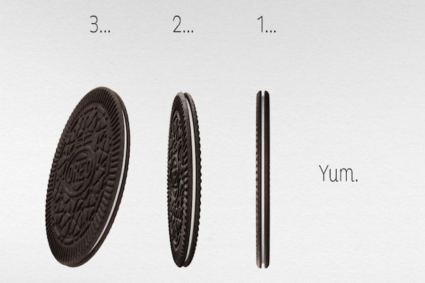
Oreos, but…better for you? The same great taste, but…smaller? Brilliant!
At least that’s what the new Oreo Thins Ads would have us believe, and we think they’re doing a very convincing job.
Image courtesy of static.thefrisky.com.
The latest series of ads for the new Oreo Thins (a permanent addition to the Oreo cookie family) emphasizes a “sleek” and “clean” feel with few words and large, impactful images of the cookies–which look totally delicious, just smaller.
Image courtesy of delish.com.
The way they emphasize how “thin” the cookies are in the ad designs play into a cultural interest in healthier eating, as well as the constant shift toward slimmer, sleeker products in the tech world. For instance, the ad above shares some similarities with this ad for the Apple iPad Mini:
The iPad is sexy, so Oreos are sexy, too! The Oreo Thin ad campaign is also making clever use of celebrity and social media–for instance, not long ago, actor and comedian Neil Patrick Harris sent out this tweet:
Accompanied by this charming Instagram post:
If that doesn’t make you want Oreo Thins, I don’t know what will.
For these reasons, we have to officially declare the Oreo Thins campaign to be some Advertising that Seriously Works!